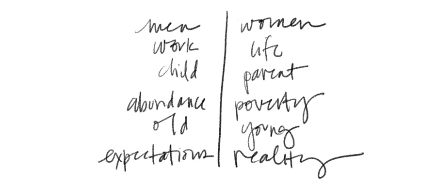
 I don't know about you, but I take on many roles. I'm a mother, a daughter (and daughter-in-law), a friend, a surrogate aunt, a wife, a sister-in-law, a business partner, a cousin, a niece. When we started to think about The Equals Project, it was important for us to visually think about the constant straddling that women do. While at the core of our beings, we are equals — equals to men, equals to each other — we often live with one foot on either side of an invisible line. Our logo brings that line to the surface. Equals straddles a solid line, indicative of the many divides we encounter—men/women, work/life, child/mom, abundance/poverty, old/young, privileged/
In our minds, while we are always on one side of the line or the other depending on the situation & circumstances, we are never complete without the other side, whether that other side represents an opposing idea or different people. It's the other side that makes us who we are as much as our own side. We are what we are because the dichotomy exists. This brings it back around to The Equals Project's mission and purpose—to widen the discussion about women's experiences. None of us are who we are without the experiences of others, and by understanding others, we gain a deeper understanding of ourselves. We hope that while we all peruse, read, and discuss, coming into contact with stories, opinions, and experiences that are different than, or similar to, our own, we can gain that deeper understanding.